How Microsoft Copilot 365 in Excel Helps with Data Analysis
Microsoft Copilot for Excel is a powerful tool that leverages AI to help you analyze your data more efficiently and effectively. In this blog post we will focus on the Understand functionality in Copilot for Excel.
It can automatically generate insights by identifying patterns, trends, and anomalies in your datasets. For example, if you have sales data, Excel Copilot can highlight which products are performing best, identify seasonal trends, and even forecast future sales based on historical data. This allows you to make data-driven decisions quickly without needing to manually sift through large amounts of information.
Additionally, Excel Copilot can assist with complex data analysis tasks such as creating pivot tables, generating charts, and performing statistical analyses. It can suggest the best ways to visualize your data, making it easier to understand and present your findings. Whether you’re looking to summarize data, perform what-if analysis, or simply clean up your dataset, Excel Copilot provides intelligent recommendations and automations that save you time and enhance your productivity.
Table of Contents
- Sample Data
- Starting Copilot for Excel
- Getting Started
- Find Insights
- Spot Trends
- Get a count
- Visualize the data
- Visualize relative values
- Sum by Category
How to Analyze Your Data Using Microsoft Copilot 365
Sample Data
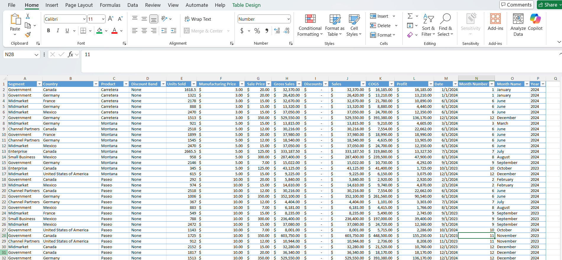
We will use the file below for the samples we show in this blog post.
Click here to download the file if you would like to follow along.
Starting Copilot for Excel
Getting started with Copilot in Excel is straightforward and can significantly enhance your productivity. Here are the initial steps to begin using Copilot:
- Open Excel: Launch the Excel application from your Microsoft 365 suite.
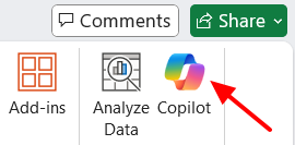
- Find the Copilot Icon: Look for the Copilot icon in the toolbar. If you don’t see it, you might need to enable it.
- Enable Copilot: Go to the “File” menu, select “Options”, then “Add-Ins”. Check if Copilot is listed under “Active Add-ins”. If not, you may need to install or activate it through your Microsoft account.
- Start Using Copilot: Once activated, Copilot will appear as a chatbot in the lower right corner of the Excel window.
Getting Started - Understand Prompts for Excel
Understand for Microsoft Excel
When you open Copilot for Excel. You will see the following options.
- Create Formulas
- Understand
- Apply color and formatting
- Ask Copilot
Click Understand and we will run through what happens next.

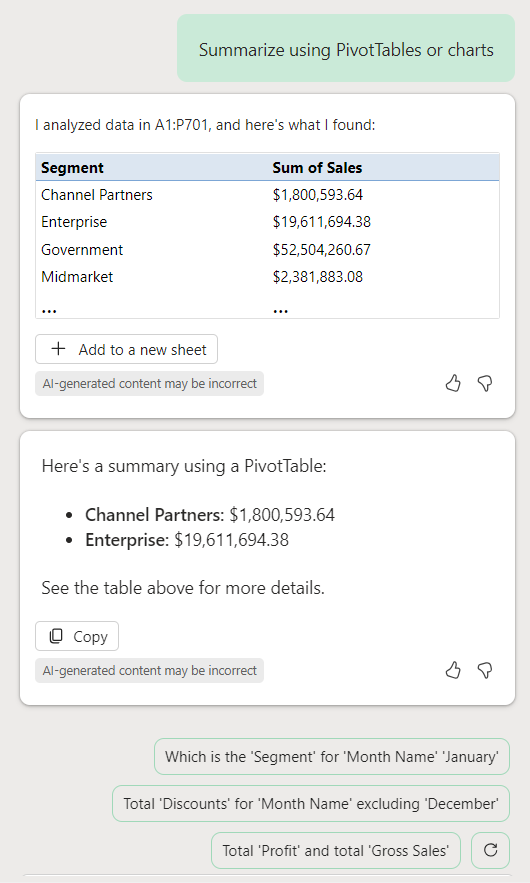
The automatic response is “Summarize using PivotTables or charts”. The response comes back in 3 segments.
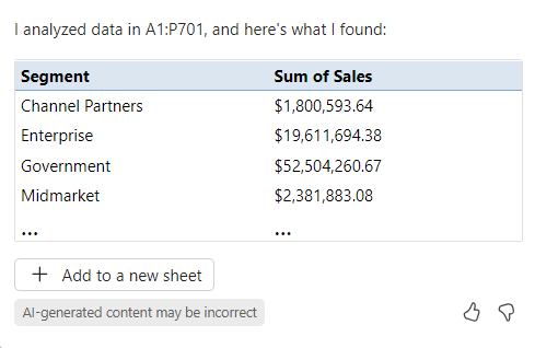
Copilot creates a PivotTable (see image above) with the information in your datasheet. Notice Excel Copilot automatically knows the range of your data. If the PivotTable is something you would like to use, click + Add to a new sheet.
** You must return “Sheet1”, where the data is located, in order to continue analyzing with Copilot Excel.
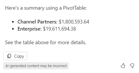
It will also give a summary (see image above) using the PivotTable.
Finally, it highlights additional prompts (see image above) based on the spreadsheet for additional queries you can trigger.
You will also notice that you have the option to give a like or dislike for the information returned sending back feedback to the model.
Viewing All Excel Prompts
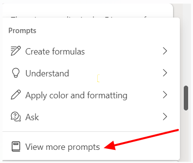
Click the “View prompts” button below. This will give you a good idea of the action items you can take on your data
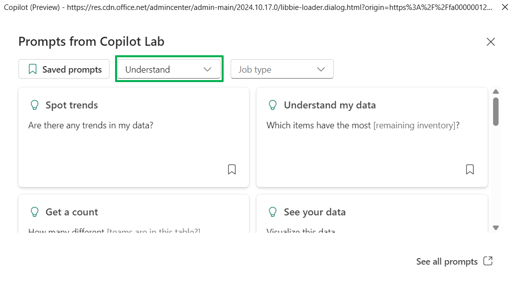
Select the “View more prompts” button to view all the categories / options for Copilot with Excel.
Now you can view all the different options and categories to help you understand the data.
Insights - Using Microsoft Copilot in Excel to get Insights
Insights refer to specific, actionable pieces of information derived from your data. These can include:
- Summaries: Condensed overviews of large datasets.
- Key Metrics: Highlighting important figures like totals, averages, or percentages.
- Outliers: Identifying data points that deviate significantly from the norm.
- Patterns: Recognizing recurring themes or anomalies in the data.
For example, Copilot might analyze your sales data and provide insights such as the top-selling products, the most profitable regions, or unusual spikes in sales.
Example Prompts:
- “Show insights for the last quarter’s sales data.”
- “Provide insights on customer feedback scores.”
- “Generate insights on monthly expenses.”
Using the “insights” prompt helps you quickly make sense of large datasets without needing to manually create complex formulas or charts.
Lets go through some examples
Overview Example
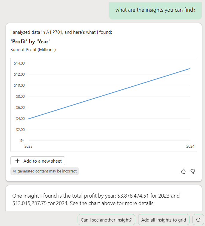
“What are the insights you can find?”
Copilot gives us back an insight for total profit by year. Additionally, we can see additional prompts for another insight or add all insights to grid. Lets click Add all insights to grid.
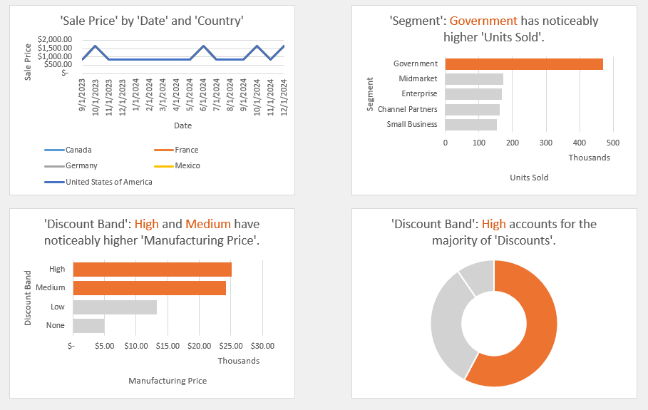
The above are just some of the insights added to our sheet. This is very powerful information and can greatly help decision makers make sense of data.
Lets look at some more examples based of prompts they will input.
Summary Example
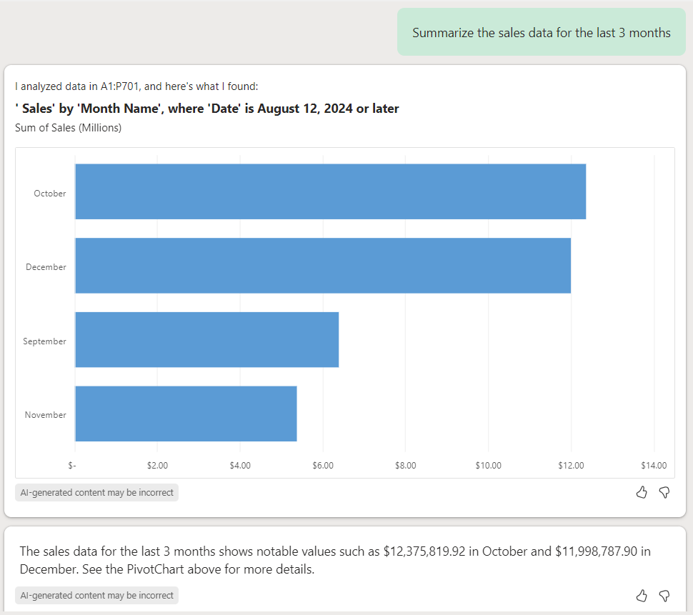
“Summarize the sales data for the last 3 months?“
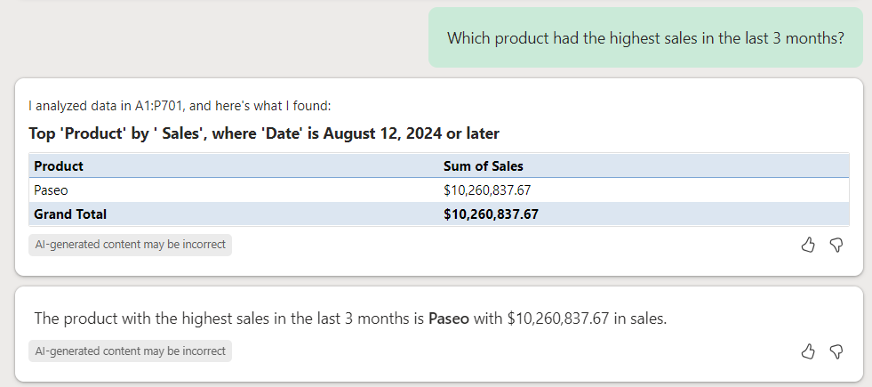
Key Metrics Example
“Which product had the highest sales in the last 3 months?”
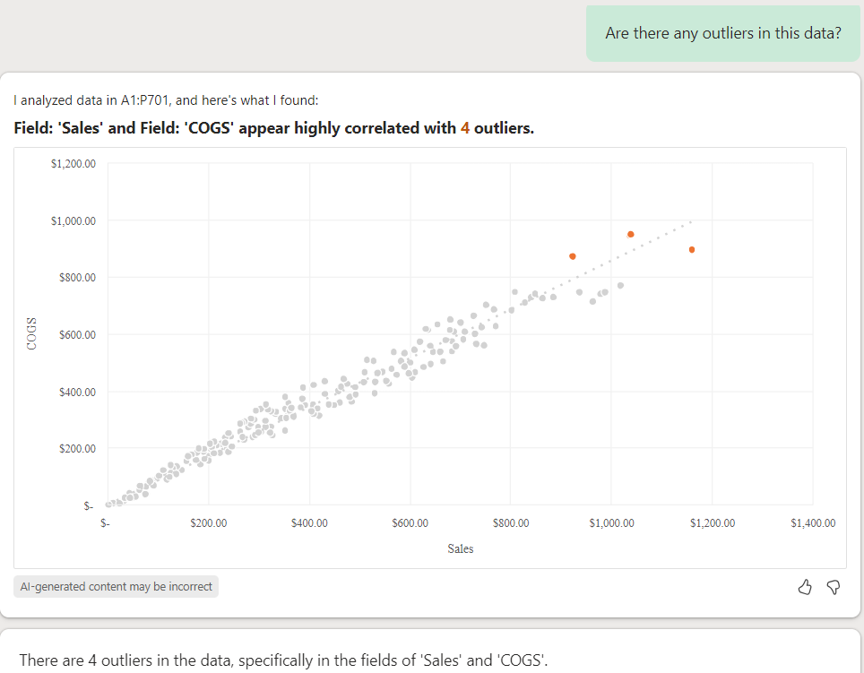
Outlier Example
“Are there any outliers in this data?”
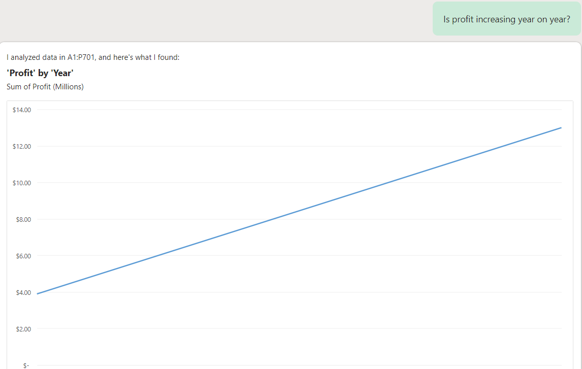
Pattern Example
“Is profit increasing year on year?”
Trends - Using Microsoft Copilot in Excel to view Trends
Trends focus on the direction and changes in your data over time. These can include:
- Growth Patterns: Showing how metrics like sales or user engagement have increased or decreased over a period.
- Seasonal Variations: Identifying regular fluctuations that occur at specific times of the year.
- Forecasts: Predicting future values based on historical data.
For instance, Copilot can help you visualize trends by creating charts that show the rise and fall of sales over the past year, helping you understand long-term performance.
Example Prompts:
- “Show trends in monthly sales data.”
- “Identify trends in customer satisfaction scores over the past year.”
- “Visualize the trend of expenses over the last quarter.”
Using the “trends” prompt helps you quickly identify and understand how your data changes over time, making it easier to spot patterns and make data-driven decisions.
Lets go through some examples
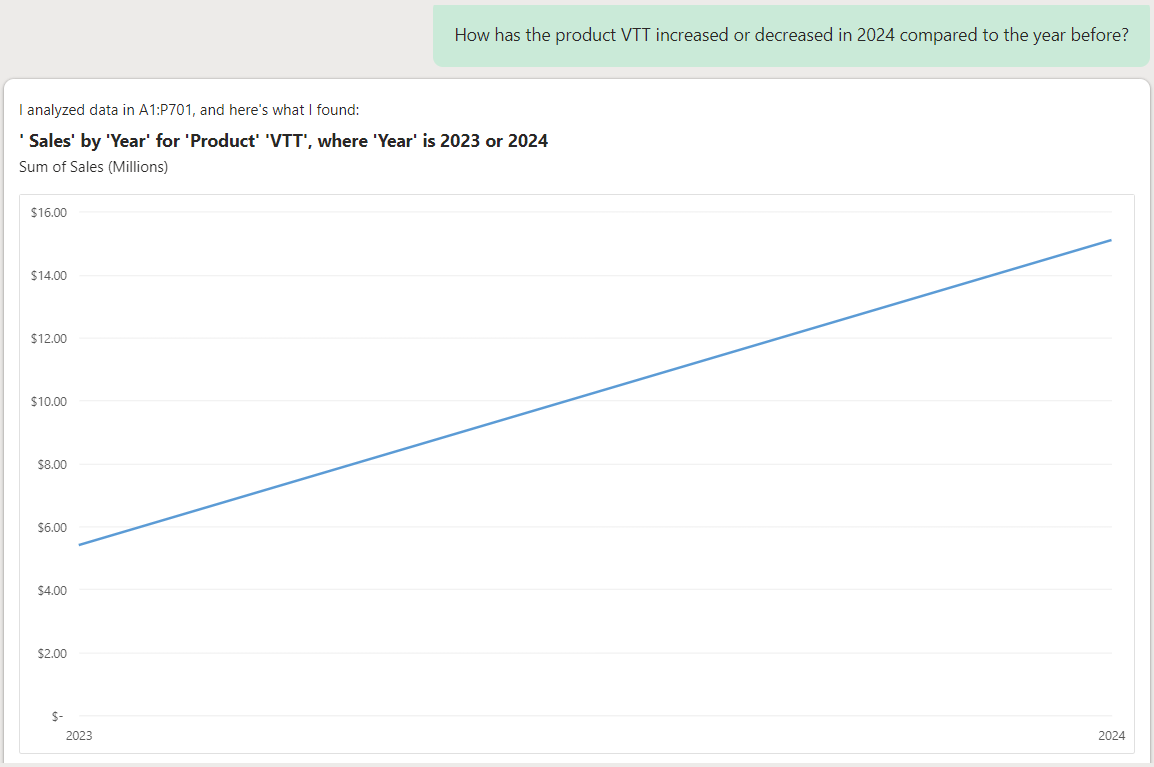
Growth Pattern Example
“How has the product VTT increased or decreased in 2024 compared to the year before?“
Seasonal Variation Example
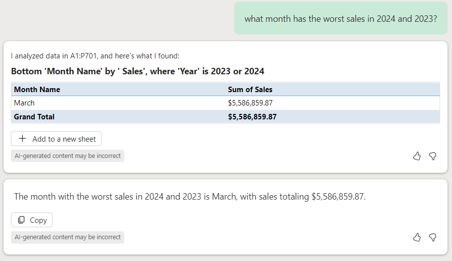
“what month has the worst sales in 2024 and 2023?“
Forecast Example
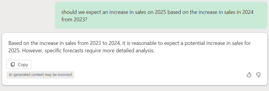
“Should we expect an increase in sales on 2025 based on the increase in sales in 2024 from 2023?“
Get a Count
In Copilot for Microsoft Excel, the “get a count” prompt is used to quickly calculate the number of items in a selected range of data. This can be particularly useful for tasks such as counting the number of entries in a list, the number of occurrences of a specific value, or the number of non-empty cells in a range.
Examples of “Get a Count” Prompts:
- “Get a count of all rows in this table.”
- “Get a count of cells with values greater than 100.”
- “Get a count of unique customer IDs.”
- “Get a count of completed tasks.”
This feature helps you quickly obtain numerical insights from your data without manually creating formulas123.
Count Example
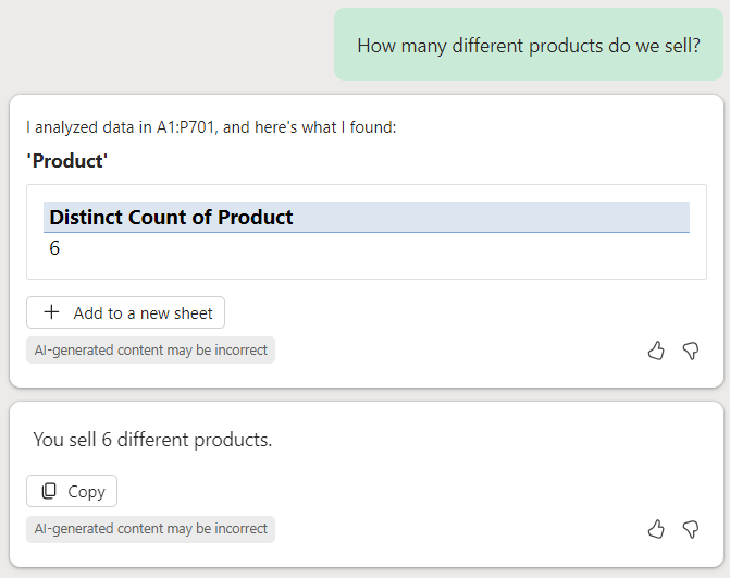
“How many different products do we sell?“
Visualize the Data
In Copilot for Microsoft Excel, the “Visualize the Data” prompt is designed to help you create visual representations of your data quickly and easily. When you use this prompt, Copilot analyzes your data and suggests the most appropriate types of charts or graphs to effectively display your information. This can include:
- Bar Charts: Useful for comparing different categories.
- Line Graphs: Ideal for showing trends over time.
- Pie Charts: Great for illustrating proportions and percentages.
- PivotTables: Summarize large datasets and allow for interactive data exploration.
- Scatter Plots: Show relationships between two variables.
- Heatmaps: Highlight areas of high and low values within a dataset.
How to Use the “Visualize the Data” Prompt:
- Select Your Data: Highlight the range of cells you want to visualize.
- Open Copilot: Click on the Copilot icon in the Excel ribbon to open the Copilot panel.
- Enter the Prompt: Type “Visualize the Data” into the prompt box. You can also specify the type of visualization you want, such as “Create a bar chart of sales data.”
- Review Suggestions: Copilot will analyze your data and suggest the best visual formats. You can preview these suggestions and choose the one that best fits your needs.
- Insert the Visualization: Once you select a visualization, Copilot will insert it into your worksheet.
Example Prompts:
- “Visualize the sales data for the last quarter.”
- “Create a line graph showing monthly expenses over the past year.”
- “Generate a pie chart of market share by product.”
- “Show a heatmap of customer satisfaction scores.”
Using the “Visualize the Data” prompt helps you quickly transform raw data into meaningful visual insights, making it easier to understand and communicate your findings.
Visual Data Example
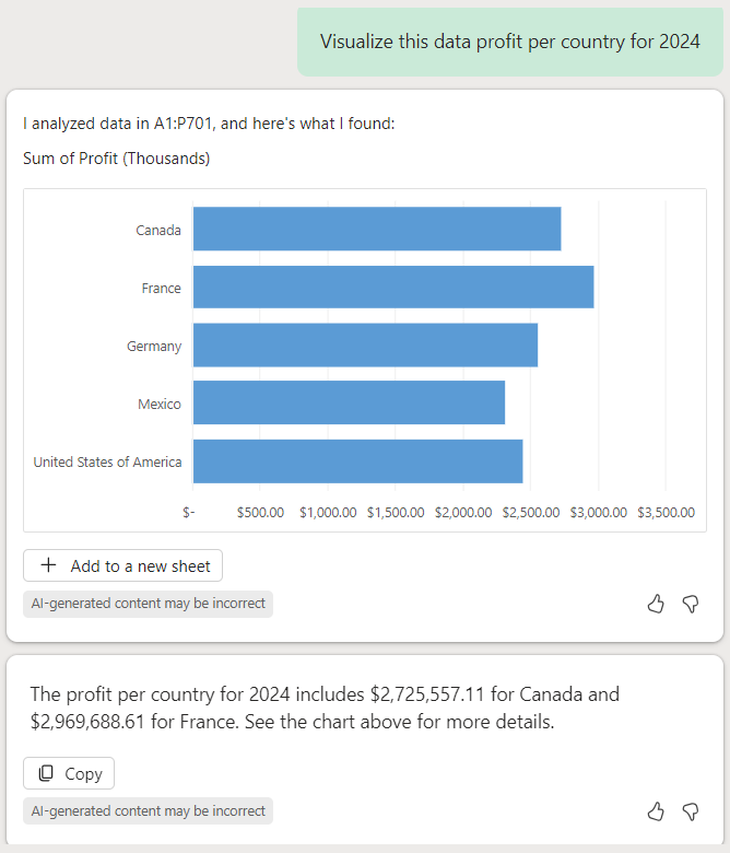
“Visualize this data profit per country for 2024“
Visualize Relative Values
In Copilot for Microsoft Excel, the “Visualize relative values” prompt is used to create visual representations that compare different data points relative to each other. This is particularly useful for understanding proportions, percentages, or other comparative metrics within your dataset.
How to Use the “Visualize Relative Values” Prompt:
- Select Your Data: Highlight the range of cells you want to visualize.
- Open Copilot: Click on the Copilot icon in the Excel ribbon to open the Copilot panel.
- Enter the Prompt: Type “Visualize relative values” into the prompt box. You can specify the context, such as “Visualize the percentage of total revenue from each region.”
- Review Suggestions: Copilot will analyze your data and suggest the best visual formats, such as pie charts, bar charts, or PivotCharts, to display the relative values.
- Insert the Visualization: Choose the suggested visualization that best fits your needs, and Copilot will insert it into your worksheet.
Example Prompts:
- “Visualize the percentage of total revenue from each region.”
- “Show the relative contribution of each department to the overall budget.”
- “Create a pie chart of market share by product category.”
Using the “Visualize relative values” prompt helps you quickly understand how different parts of your data compare to each other, making it easier to identify key contributors and make informed decisions.
Visual Relative Values Example
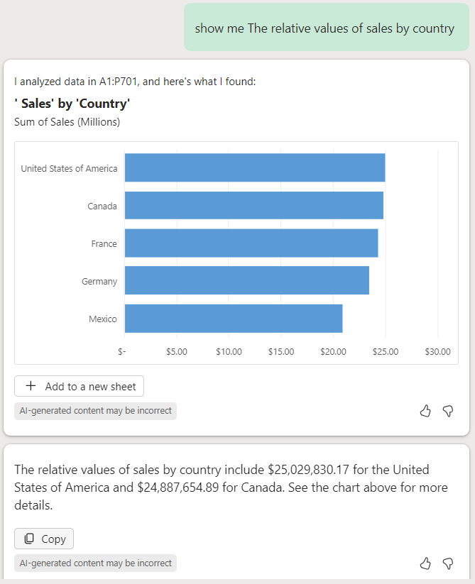
“Show me the relative values of sales by country“
Contact Us
Vestibulum ante ipsum primis in faucibus orci luctus et ultrices posuere cubilia Curae; Donec velit neque, auctor sit amet aliquam vel, ullamcorper sit amet ligula.


